Inoreader’s Integration Options, Pt. 2
by joshg253
In Part One, I looked at a couple image-heavy sites and how they behaved when adding their posts to each of the external services available via Inoreader. This time I’ll look at guitar lessons from a few different places – same as with the previous post, the websites differ and therefore show up differently in each service.
Guitar World lessons
Firefox
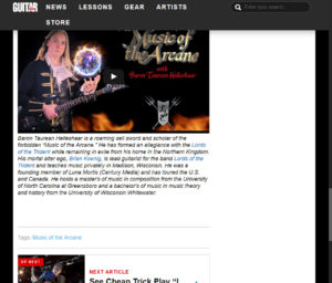
The actual article in Firefox: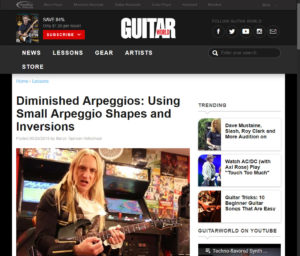
Inoreader
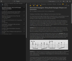
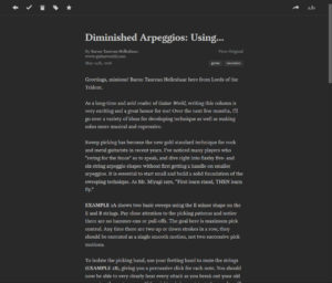
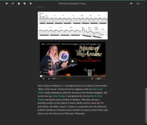
Pocket doesn’t let the reading area get very wide, so the images can get pretty small, which makes some of the Examples hard to read.
Instapaper
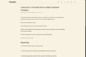
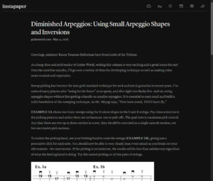
Instapaper allows a wider reading area than Pocket, so the Examples don’t get squished and are easy to read.
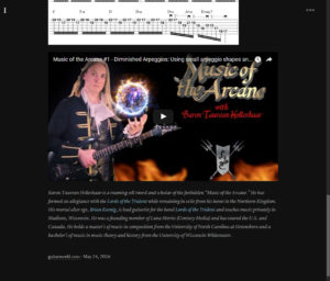
Readability
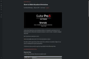
Readability also allows wider reading area, but apparently compressed the images more than the others, making the Examples blurry and harder to read.
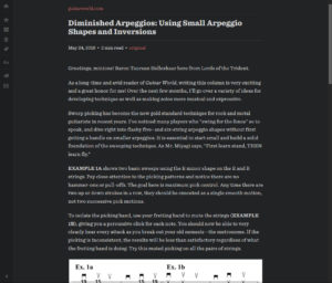
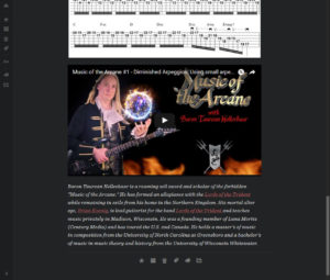
Evernote
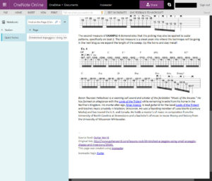
OneNote
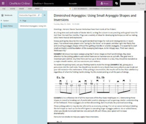
OneNote makes the images blurrier than EverNote:
Dropbox
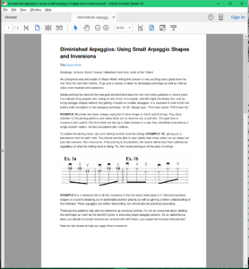
The PDF actually turned out decent this time, but the images are a little blurry:
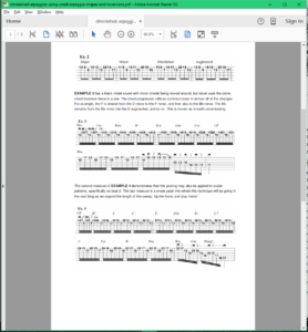 Voids of whitespace occupy areas once lush with embedded video, resulting in an essentially wasted last page in this example, but you could use a PDF tool to delete it if needed:
Another Guitar World Sample
Another example yields nearly exact results with most of the services, except this time the strange splitting of web elements across pages in the resulting Dropbox PDF.
Sliced bottom off a line of text:
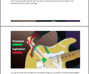
 Sliced a few pixels off the top:
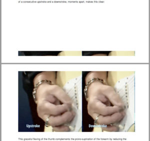
 More off the next image:
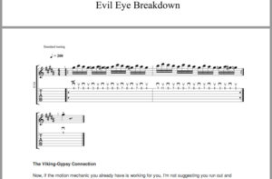
 And even more off the next one. At least it’s between the text in the image, but this specific example would better unsliced:
Verdict for Guitar World
Read it later: Instapaper – Pocket scales the images width-wise, making them hard to read. Readability compresses the images making them blurry, also making them hard to read.
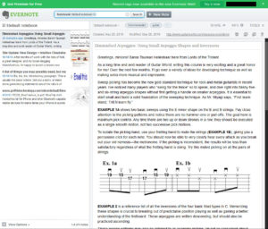
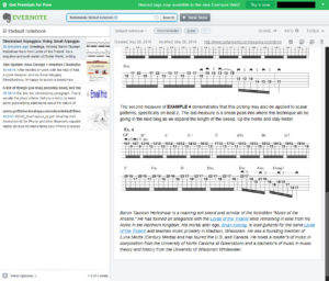
Editable copy: Evernote – OneNote has slightly blurrier images.
Inconsistent PDF results: Dropbox – first sample yielded a decent PDF but the second was the same element-splitting weirdness we’ve seen previously. If you were to actually print them, both samples provided plenty of whitespace for notes. :)
Premier Guitar
Firefox
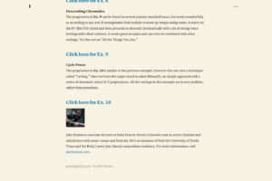
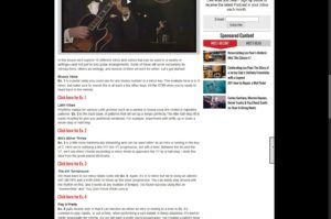
The actual article in Firefox has a link to a PDF version of the lesson, embedded video, and links for each Example that open a new tab with a cool audio player that follows the musical notation & guitar tabulature as it plays.
Inoreader
The article in Inoreader just contains a summary text:
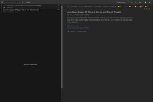
Just a link to the actual article again.
Instapaper
Includes some webpage artifacts, and the first image twice at the top:
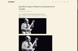 Also included are the PDF link, the embedded video, and the player links:
Readability
The PDF link, and the embedded video are lost:
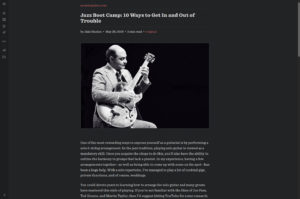
The player links are intact: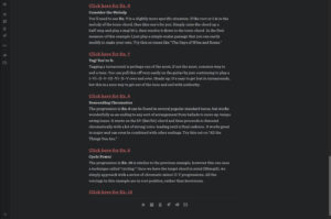
Evernote
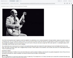
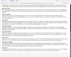
Loses the PDF link, the embedded video, and the player links:
OneNote
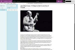
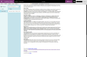
Also loses the PDF link, the embedded video, and the player links:
Dropbox
Starts out good, but also loses the PDF link, the embedded video, and the player links:
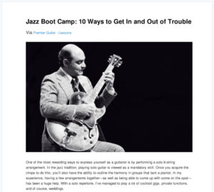
Vast whitespace again:
Sliced off text again:
Verdict for Premier Guitar
Read it later: Instapaper – Nothing is perfect for this one, but at least Instapaper doesn’t lose any of the links.
Editable: It doesn’t matter – Evernote and OneNote both lose the links to what essentially makes these lessons.
Meh PDF: Dropbox, but it’s useless for this example because of the individual links & audio for each example.
Guitar Chalk
Firefox
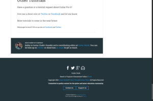
The actual article in Firefox has an embedded video, several images, and a few links:
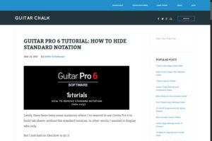
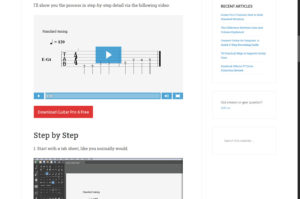
Inoreader
The article in Inoreader is just a summary:
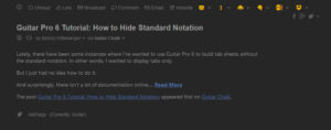
Loses the video, the images, and the links:
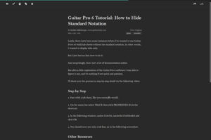
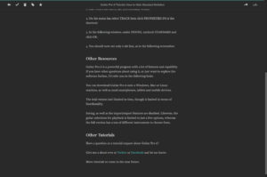
Instapaper
Readability
Evernote
OneNote
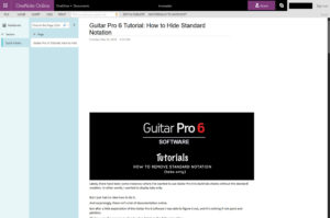
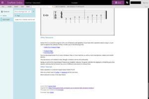
Loses the video. Before each image, there is an empty space the same size as the image that follows it:
Dropbox
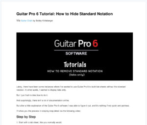
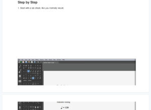
Loses the video, slices the images terribly again:
Verdict for Guitar Chalk
This one is a mess – might be better just to tag it in Inoreader.
Tune In Next Time
I need to look in Pocket to see if anything else doesn’t appear as expected, which is how I started along this path in the first place. Looks like it’s gonna be a little while before I can see my old articles in Inoreader though. :\
Depending on the outcome of that, the next post will either be a wrap-up (with an overview, recommendations, a table with source vs service, and links to the previous posts), or yet more experimenting. :)
tags: Dropbox - Evernote - Inoreader - Instapaper - OneNote - Pocket - Readability - RSS